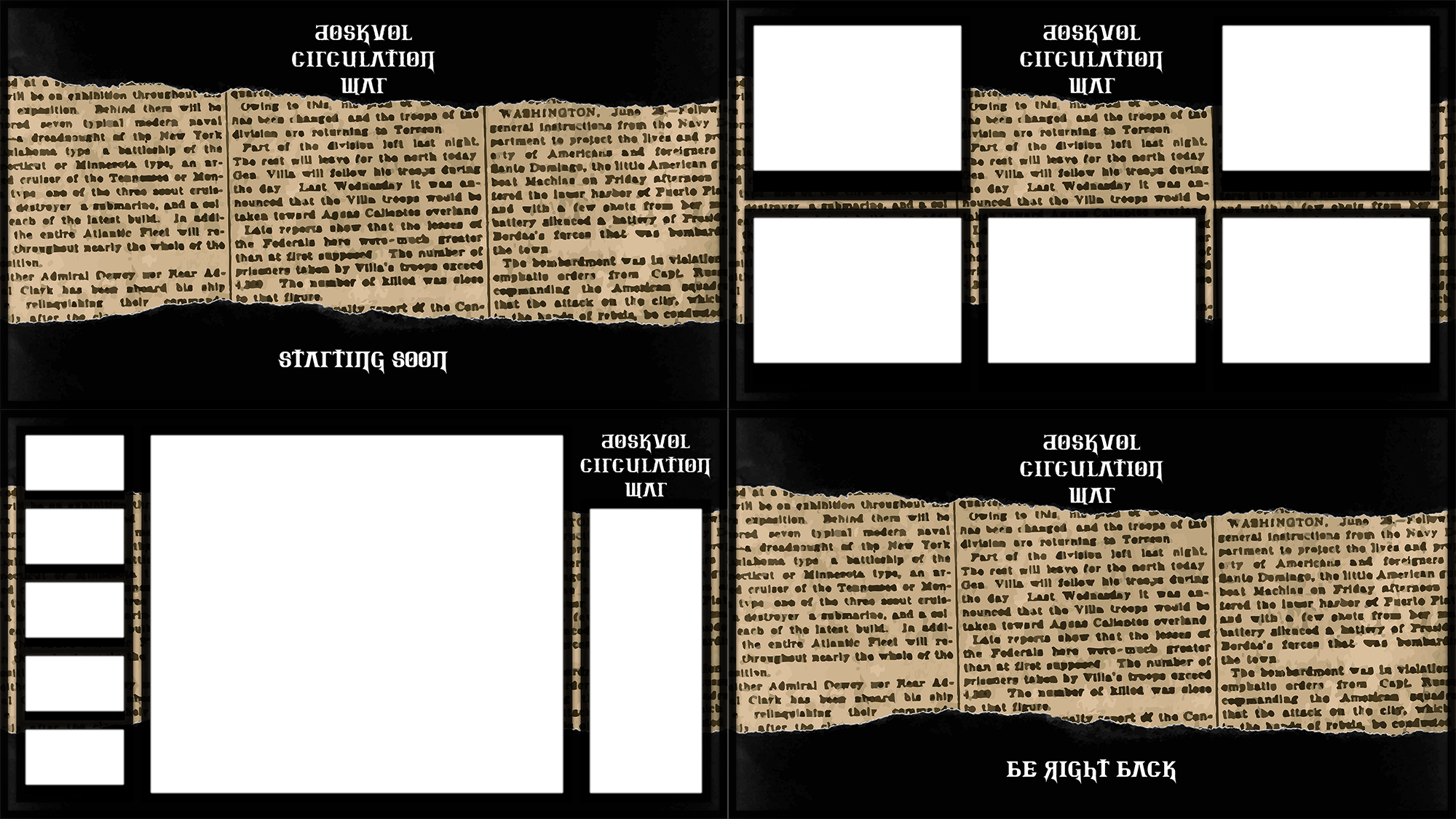
Inspired by a bunch of folks here, I’ve cooked up the overlays and Roll20 set-up for a game I’ll be streaming very soon (Session #0 next week, Thursday 14th, 7PM – 10PM AEST). We’ll be hosted at https://www.twitch.tv/benscerri.
The game’s called The Doskvol Circulation War, and the premise is:
Whilst the Skovlan Unity War is over, the seed of rebellion lives on. Inspired by their comrades across the ink-black sea, revolutionaries in Duskwall are ready to light the fire of a popular uprising…they just need a vector for their message. A broadsheet! But a falling out, just as things are getting started, may spell the inevitable collapse of these Duskwall Communists. Two competing newspapers are starting, and the Doskvol Circulation War is just beginning.
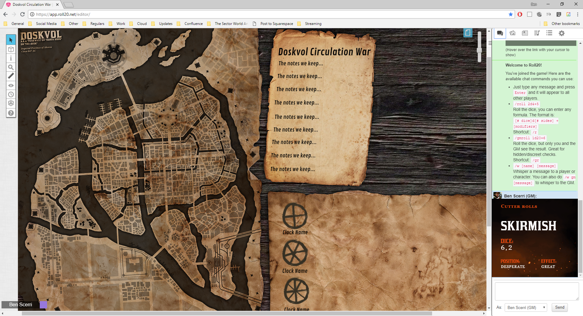
Here’s how we’re looking!


That looks awesome. I’ve been trying to create something similar recently to make the roll20 environment feel more true to the setting. Did you age that map yourself?
Craig MacGregor I used a heavily contrasted version of the map found on this G+, and then on Photoshop used a Multiply layer to put it over a parchment texture I found on a free texture archive.
We had our Session #0, if folks are keen to check it out! twitch.tv – Twitch
Knocked this up as I liked your layout. It’s pretty similar! Will see how it goes soon with a new group.
https://lh3.googleusercontent.com/dKOj8n-bLBZ85Un0h2_36VZptTGy4ZkeHOWsJrJ8b4dK6GxLh0aeZ0txIrwhdCFitcN1uGDtsqUE9APf0D9Yp6Nr79CFEZp2inU1=s0
Craig MacGregor Would you be interested in sharing the separate images? I like your style the best so far and would love to use them!
Jas X Yea no worries. Don’t want to hijack Ben’s thread so will post separately later when I get a chance.
Started watching your Session 0 Ben Scerri, have you done any more sessions yet?
Feel free to share them here! I got my ideas, and some assets, from this group, so I don’t mind sharing the sharing-space!
https://lh3.googleusercontent.com/0RFiYJ7ztnFb5SkqblbkUqHyT3ijC_twadTzbU-RNu8P30HReQgiCz_K5IrgpOnD2CLFvneYOF7zphcFkeqaq5OhTInf0_wpEM6O=s0
https://lh3.googleusercontent.com/9JPhb7G6d54UKXOxUykKWknVg9PJliwkcSYcCWEOmLX57T7OmG2N2PjHVyxCvaH93QyOx4RsJkm2N8tf7bhTWqS75vsyJ3uescN8=s0
https://lh3.googleusercontent.com/KM-19v6KG_CtizKF9vvmhekPEettkvhwsNb-83pczbFE1rID3RElGsQJU09S_D6UnX-ZI8anjeuoeiKb0x2WsZWq5s0TMXfC8uYg=s0
https://lh3.googleusercontent.com/Qr5RgEo7ohZ7duzK8u6McSwgu9I5LHFV5ES6kyZjgYhoyr1VnpoCmgMMiu89GRLBZnXoYtG5gd-bkkD0vO2L3hxZuKS-aF_fcg31=s0
Jas X There you go. They exported rotated how I had them on my original image, but I’m sure you can work out how to rotate them how you need them. They are mostly just paper textures I found on google image search anyway, with drop shadows added and I edited the colours a little. The map took the longest as I had to mask the edge and add the text as if it was written on. I can export a version without text if that’s helpful. For reference, I compiled them into one image (see above) before putting them into Roll20 because I think it handles one image better than several with transparencies (and takes less space).