
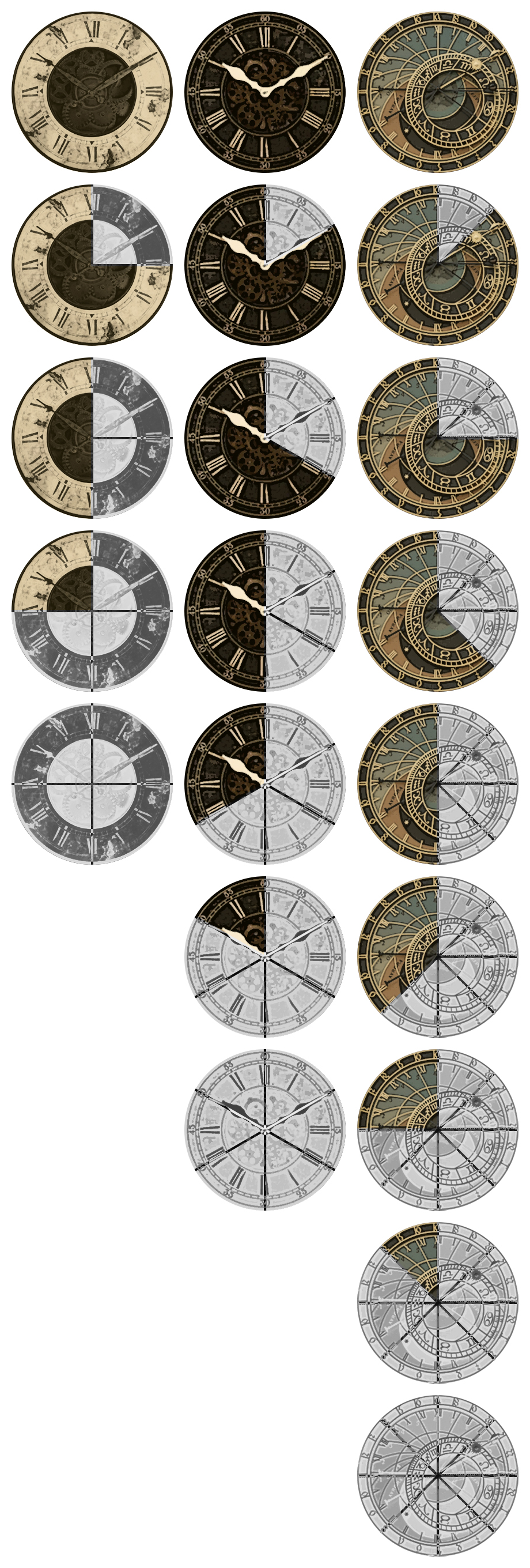
Usually, to get my GM juices flowing I need to faff around on Photoshop a bit. This time, I decided to try and create some BitD themed roll20 clocks!
Admittedly, they’re a bit busy looking, but all in all I’m fairly pleased with the result.
Also, since they’re here, if anyone fancies using them, pngs are all available here, along with a couple other PbtA clocks: https://drive.google.com/drive/folders/1bmwz5gi4TXOKryOnAhN8mhi9LUyehWwi?usp=sharing
For some weird reason they’re super fun to make, so any feedback or ‘skin’ idea are more than welcome!
WTB a scifi one. Also you should put these up in the roll 20 store ^_^
These are rad!
Wicked!
I like how the face of each clock gets more complex as the number of segments increase. Also love the style of the analog noir clocks, fits the aesthetic of BitD real well.
I love the attention to detail. is not super clear though it’s more of art download for me 🙂
Increase contrast a hair though..
Thanks everyone!
Stras Acimovic I’m already workshopping some scummy and villainous clocks, but I haven’t nailed down the aesthetic just yet…stay tuned! (or, you know…you could tease some more art for the schmucks who hopped on the bandwagon way too late wink )
Also, I admit I don’t really know how the r20 store works, but I’ll have a look into it!
Mark Cleveland Massengale yeah, it might be a bit ‘form over function’, but the starting concept was that I’m probably going to have a grayscale background while playing, so that the filled in portions of the clocks would almost blend in and disappear…I liked the ‘time is running out’ feel it gives.
I tried with higher contrast but I didn’t really like how it felt, but I’ll give it some more thought!
I think the thing here would be contrast above all else, yeah. You can’t tell which direction is filled in when they both have the same brightness value. Make the clock, then see what it looks like in grey scale. If there is a contrast difference, it’s parseable.
In your clocks above, the four clock has a light outside/dark inside which inverts when it is filled. This makes it difficult to parse at a glance since both ways have equal brightness. The middle clock works super well, cause the brown is much darker than the gray. The last clock works a little less well since it’s so busy and both the gray-scale and the coloured one have darks and lights, but not as violent a difference as the four clock.
This is just a round about way to make the suggestion:
Make the non filled in light, and the filled in dark, regardless of colour. (Or vice versa, since you said you wanted the filled-in clock to fade into the background. Personal preference: I’d want to see the filled in clocks pop out instead of fade, so that there is a sense of urgency as time ticked down. “You don’t worry about this clock just yet, it’s still a background thing.” )