With SaV, every playbook has an iconic character associated with it, so that when we visualize the art for the book, we can draw from a pool of immediately recognizable people. It’s a pretty standard approach, but communicating the characters clearly and effectively took a bit of work.
I think the best tool we used was to explain the characters separately from the scenes we showed them in.
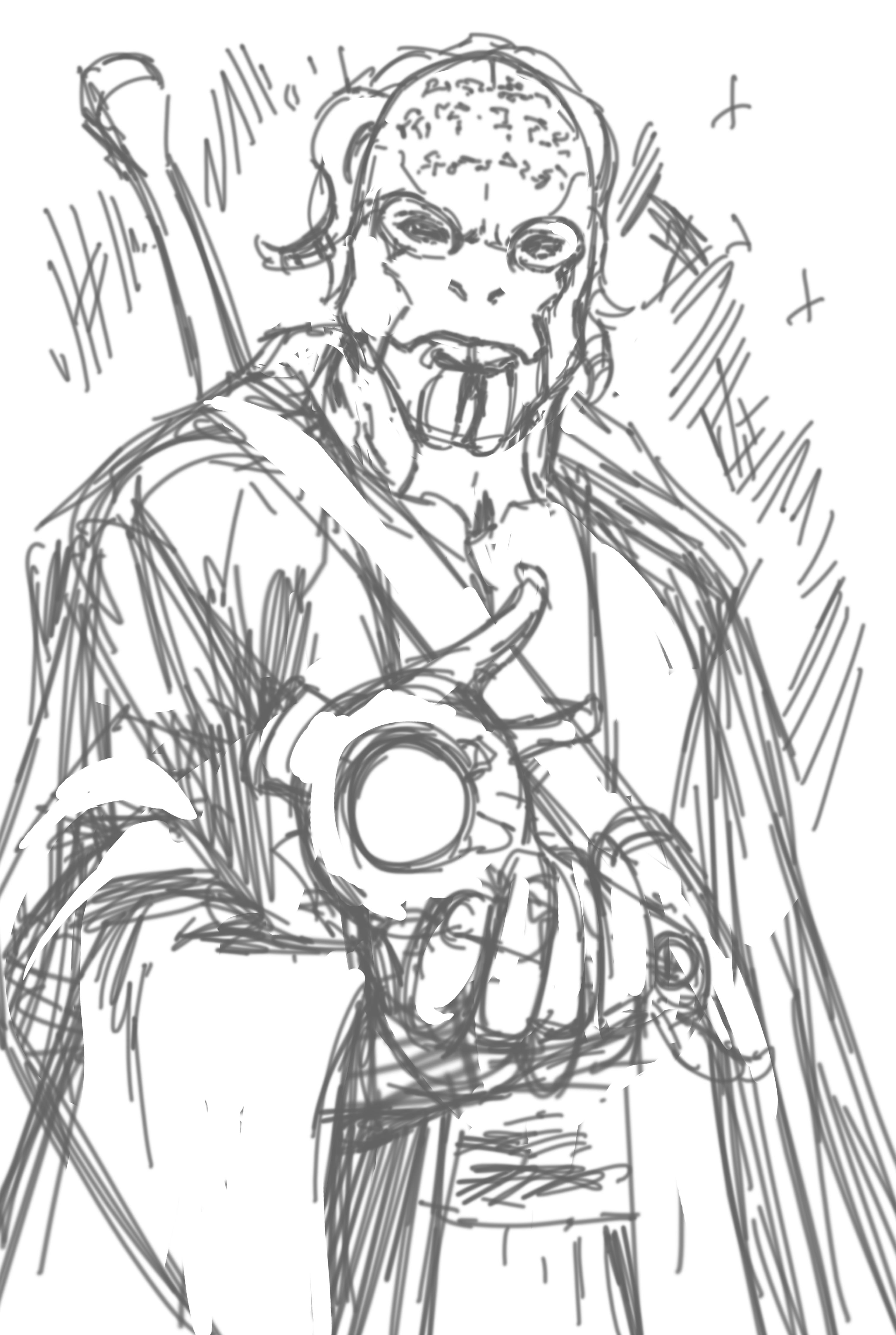
Mevakor Shrike. Male Memish – Memish are humanoids from the water planet of Mem, and have smooth blue-to-purple hued bodies and hair similar to the arms of a Cuttlefish. Mavakor is generally light blue and wears small golden rings on the ends of his hair. Ritually scarred with the holy words of the Prophet Ruum that glow when he infuses himself with Way-energies. (A Mystic is like a Jedi from Star Wars.) Mevakor generally wears loose-fitting natural clothing that leaves a lot of his arms and chest exposed. He has a wooden sword on his back he can infuse with energy to cut through almost anything. He’s quite a drinker, and is often found with a bottle of whiskey or gourd of alcohol.
https://drive.google.com/open?id=1bcTTDLuBdLhkz6oTtZ3Rul8y7LWJx1_g
This gives a good feeling of Mevakor as a character – giving options for Brett to pursue or elements that can be introduced whenever it makes sense in the picture. And it’s not limited to characters! We outlined a lot of things, including planets, various factions, how technology looks, how ships look, essentially building up a manual of style for the SaV universe.
That said, making portraits that a) demonstrate the character clearly, b) doing a thing that that character should be associated with, and c) has a sense of action to it is rather hard actually! But using this ‘describe, then pose’ technique, is a really good way to make tight scene descriptions that communicate a lot.
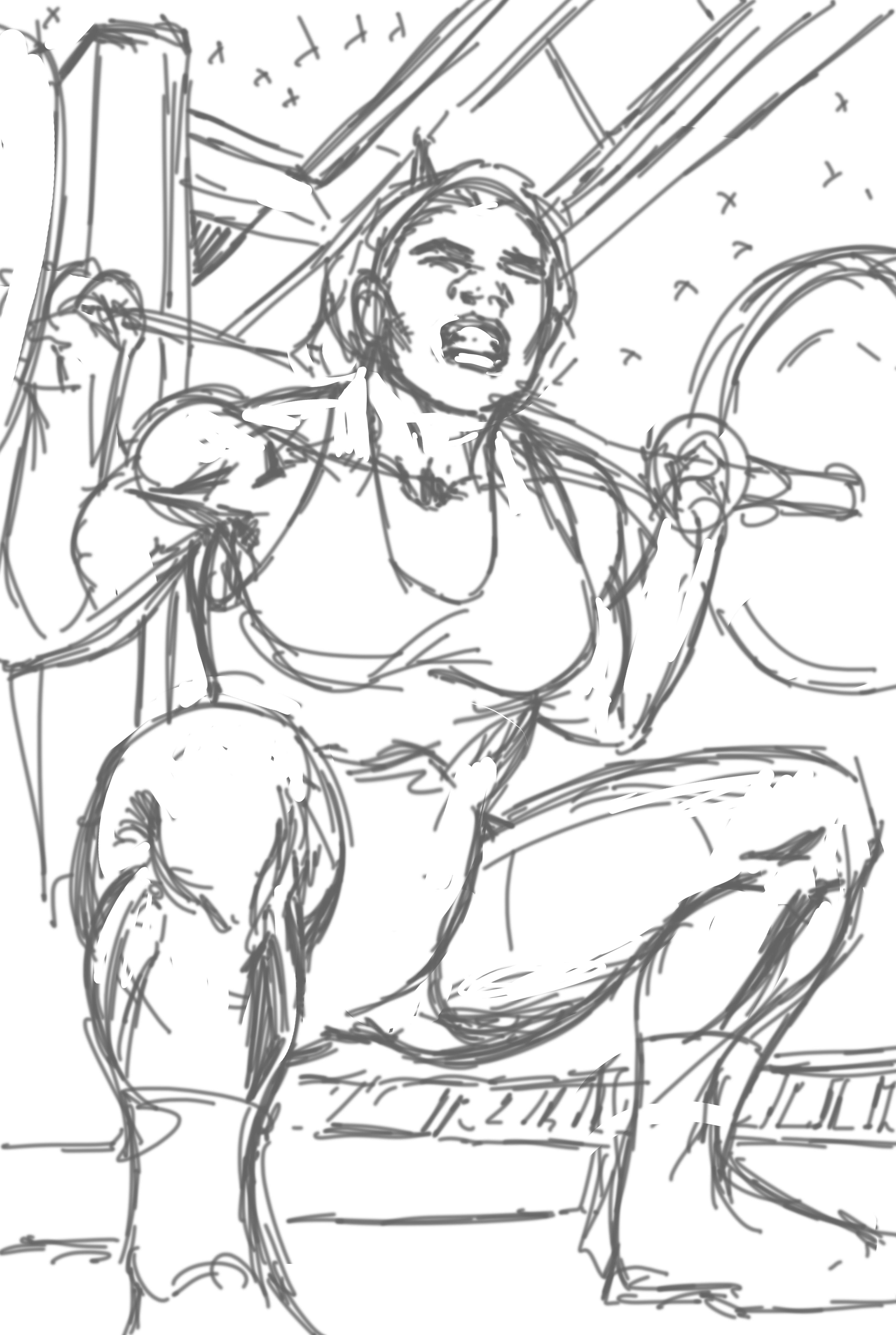
Aria is working out in the ship’s weight room. The room is spartan but serviceable. She’s doing barbell squats, but the shot is waist-up, showing the barbell resting on her shoulders. She’s in a cami, which shows off her tattoos, and her face shows the weight she’s holding.
https://drive.google.com/open?id=15YaM7rFy3DGkwmtiW18c-FXREz1nkZkt
In a lot of ways, this turned writing the art spec into an activity more like writing a screenplay, and we borrowed a lot of screenplay terms like scene headers that described the ‘shot’, a very short gist of the scene, and the lighting:
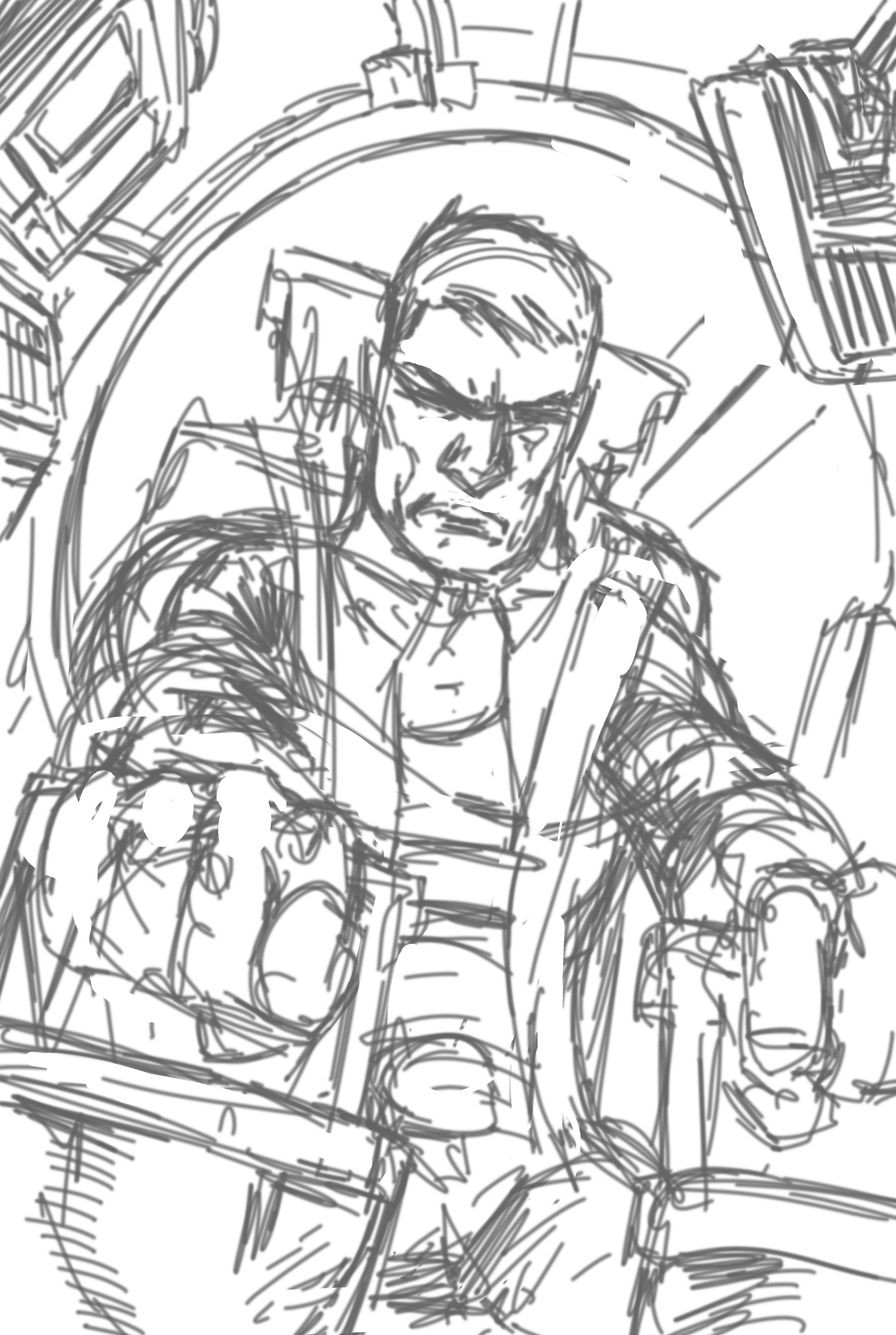
Playbook: Pilot (page 86)
Full Page
Exterior/Interior/Space, Ship Console from outside the Ship, Interior Lighting
https://drive.google.com/open?id=1W2B2RwfqYzoF-ijylEE9RlFt6Jq-hY5f
In all, the art spec alone was about six thousand words; despite being the by-product of the art process, it has become a resource all unto itself. I’ve never written one of these before SaV and now I can’t imagine doing without one.


Nice, looking forward to the final pieces, looks great.
Thanks for the insight into the creative process. Much appreciated!
David Barrena Of course! Hope it’s helpful!
It’s frakking gorgeous! I love concept arts. And your game is bright guys