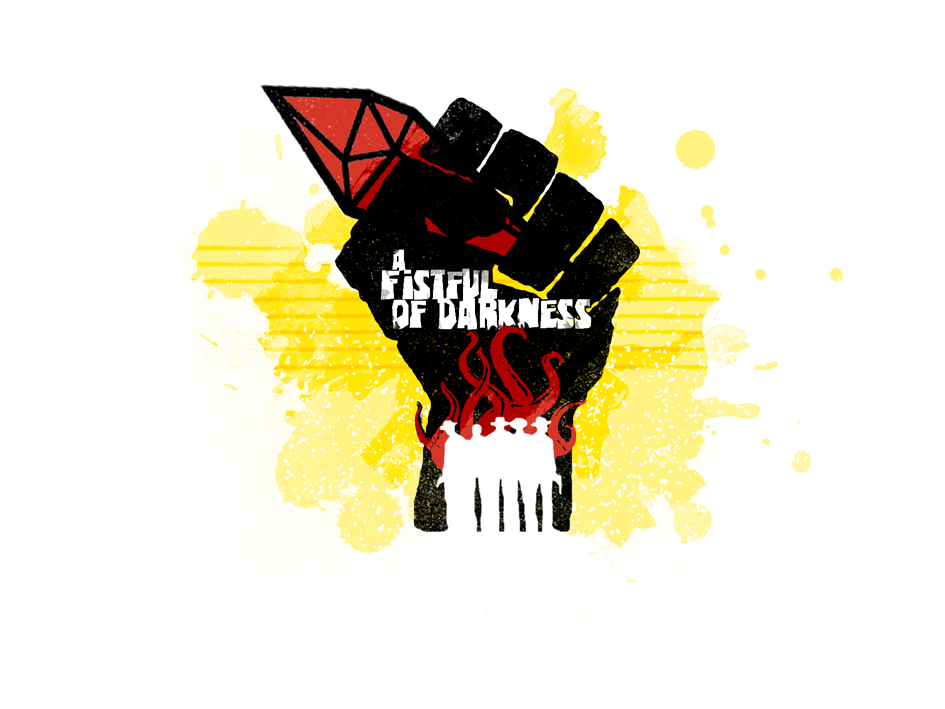
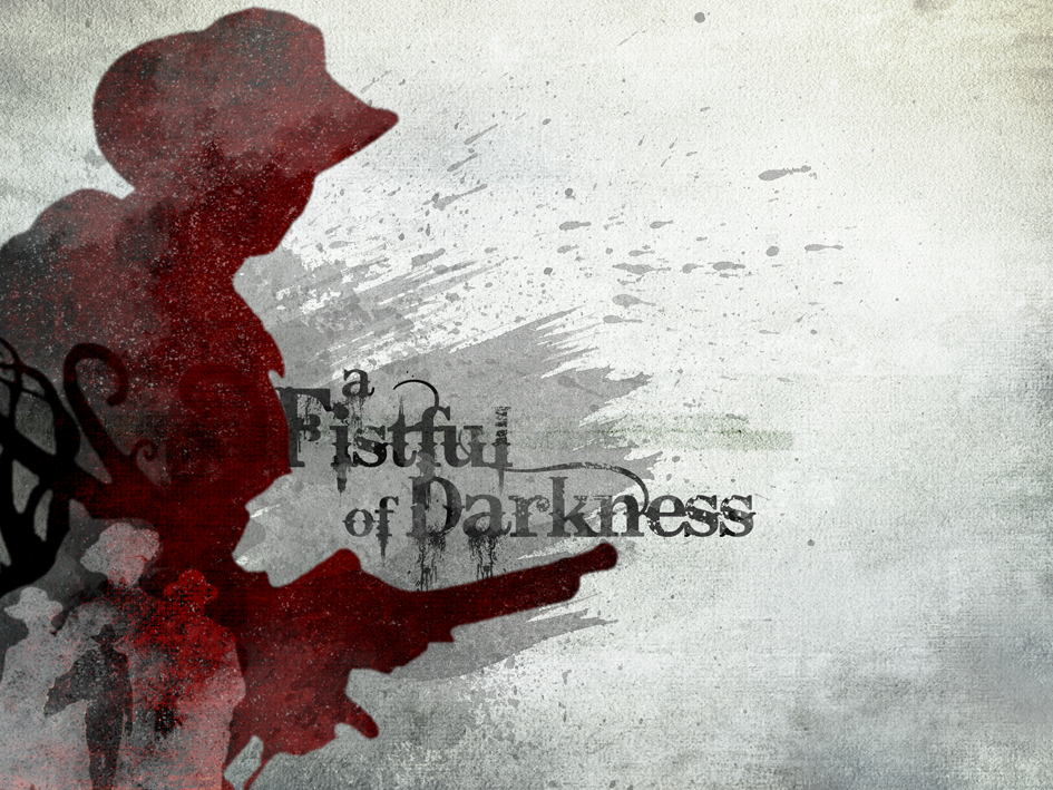
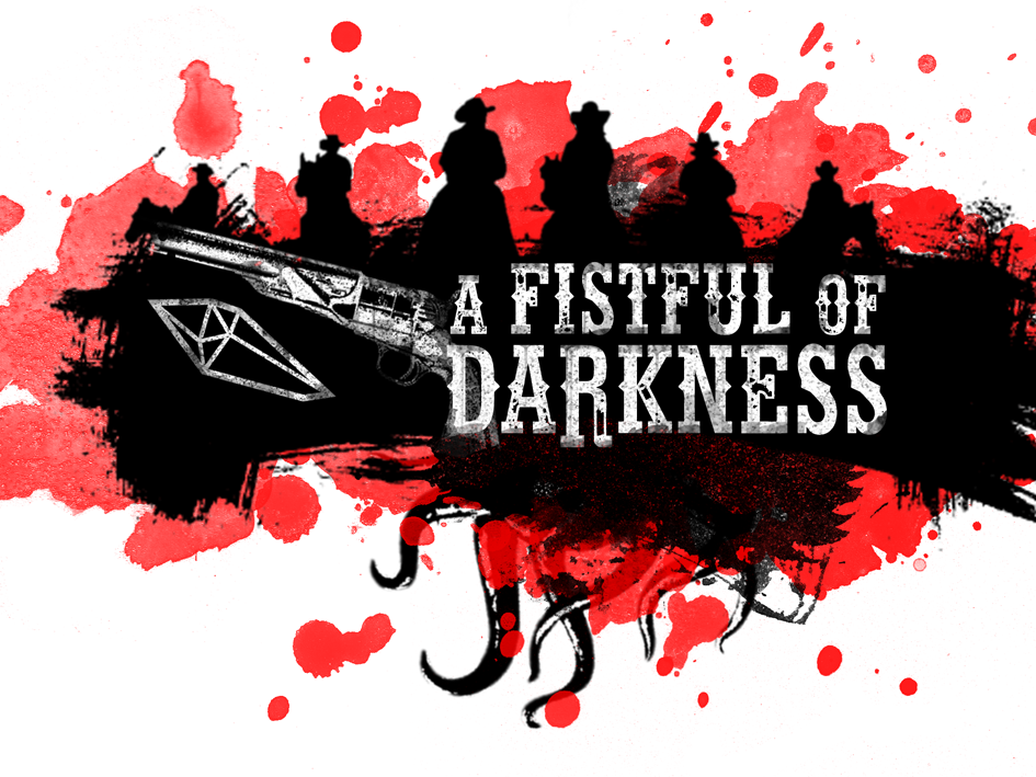
Some graphic design for “A Fistful of Darkness”, a Weird West Hack of Blades in the Dark I’m currently working on. I’m a bit stuck and doing pretty pictures is a good way to come into the mood. “Hellstone” and monsters from the deep are central elements for this hack, in case you wonder what this crystal and tentacle stuff is all about.
It would be awesome if you give some feedback which one you like most / hate least 😉 Thanks for your time. #aFistfulOfDarkness


Nice! The idea reminds me to a hacked version of Deadlands. I think FitD would fit very well with this kind of setting: Indian, military, mercenary, outlaws, bounty hunters crews and the typical sects 🙂
The three images are great. The second one is the most evocative for me!
Love all of them, but the first one is most striking to me.
First is most striking, but I think the third has the best balance between cool imagery and a clear title (though the crystal seems a bit tacked-on).
Balance your icons between left and right in your third image (or just move both to the opposite side to ease reading left-to-right) and you’ve got a winner.
Bernat Anton Deadlands is definitely an inspiration, just as Shadows of Brimstone. Funny thing is, that the main focus of the hack is not defined yet. I want to wait for the first gaming sessions with that.
Alex Huddleston Yeah! Thanks for the feedback
James Iles Alfred Rudzki Good point about the crystal. Will do a rework of this one. Thanks!
Number fucking two. I want it on my wall as a poster whether this gets made or not.
I definitely like the second one–the gunslinger shadow grips the eye and the mind immediately and says “this is gonna involve the Old West”. The other two are also pretty good, though: sort of a spaghetti western vibe in the design.
Hmm. Cthuloid beasties and Old West action? Could be awesome.
ETA: what Rebecca said! And if not a freakin’ poster, then at least a desktop wallpaper.
The second one is the best and the most subtle, in my opinion. I’m always trying to hack everything into a fantasy old west, so I’m eager for more details!
I like number 2 the best but it might need more contrast to stand out on a shelf or sales page.
Middle. Hey, how about a playing card motif? Hearts, crystals, tentacles, more tentacles?
Jared Hunt Good point.
DEFINITELY #2! That is beautiful!
I like 2 and 3. Don’t care for 1 at all. I think Toby Sennett has a good idea – perhaps a few more implements of the old West. A whisky or tequila bottle with something slithering around inside, some weird arcane sigils carved into a poker chip or written across the back of a poker deck, etc.
Thanks everybody for your feedback. #2 seems to be the most poluar. Toby Sennett Brandon Perkins Thanks for the additions. I’m not sure if I want to add something because I prefer the more minimal stuff, but I will give it a try (Jared Hunt Henry de Veuve… with more contrast!)
Rebecca W Henry de Veuve I have a bigger version available for creating your own wall paper or poster. Please contact me if you want the bigger file. As mentionend I will make some changes to it. Maybe you want to wait for them first.
For all: I’m a bit (meaning A LOT) nervous about posting my hack. My last (and former only hack) was a (crappy) Borribles hack of the TMNT/Palladium RPG in the later 80ies and that was only for my friends and was never played. So, please be kind and wait with me how the playtesting will turn out.
I promise to keep you posted and post the results nevertheless. #fistfulofdarkness
Good stuff, Stefan Struck – whenever you’re ready and comfortable, just rip that bandaid off and post it. If the game is anywhere near as good as the artwork you’ve created for it, I may finally have that weird fantasy Western I’ve been waiting for!
I also like #2, it falls within the Blades house style. Very much second on the inclusion of poker suites too. Something otherworldy like the Malifaux deck perhaps? We recently wrapped up a Deadlands game, and I’d love to see some updated ideas thrown that way.
https://lh3.googleusercontent.com/_Nul8IR2O2MIjX9xC_gMCeLT9kBfEpBaLz2EWdkK9RwCiwHP2mQjN_YGgSZu9q8qfNC9E_-Y7VYAFRQns3yaO-XYeHNNsfecn-U=s0
Stefan Struck I will most definitely be interested in the bigger file, but go ahead and take your time with the final version first. Don’t make it too visually busy! I like the simple spaghetti-Western motif as it is.
Thanks everybody for the kind remarks and suggestions. I’ll keep you posted.
Stefan Struck You are very welcome, good sir! Keeping my ears peeled for more! (And yes please on the bigger file when you’ve tweaked it enough.)
#1 is certainly … fist-y, but doesn’t say Western to me. The second one is my pick.
#2 is glorious.
New version of #2 with more contrast, some mountains and blood. Bigger version, too.
https://lh3.googleusercontent.com/3OcT4KNC1DaeQLsrKpcyhyJrRFDe7ehVr-49G5VyW7DxNxb_-b60mksVCtZHz-xnf5LRx5KxpMbDG6mF1n9ao0-UWITP98ccCZc=s0
Stefan Struck Still glorious. The contrast obviously makes the crew + tentacles stand out more. There’s some artsy/album-covery I like about the original — the abundance of negative space, perhaps.
the Fist & Crystal image has a very spaghetti Western vibe going for it which I like. The revised silhouette image looks great as well. Great work!
That updated #2 is pretty sweet (the best of the three imo)
Mark Cleveland Massengale Thanks! Means a lot because I was not sure if I overdid the contrast thing.
Garrett Fitzgerald Exactly what I was trying to steal, arg … meaning was inspired by. The font is called Eastwood and I just had to use it. Maybe even better as part of an animation (zooming in)
So, the first Alpha version of the hack is out there. Hope you like it
plus.google.com – A Fistful of Darkness – Alpha 1 Release for Playtesting So, here you go: Ano…
Some of you wished for poker cards to be included and I seem to ignore that tip: Well, I did not but used them for the Character Sheet. Have a look at that and thanks a lot for the tip.
plus.google.com – First Character Sheet Deluxe for ##aFistfulOfDarkness Inspired by +Galen Pe…