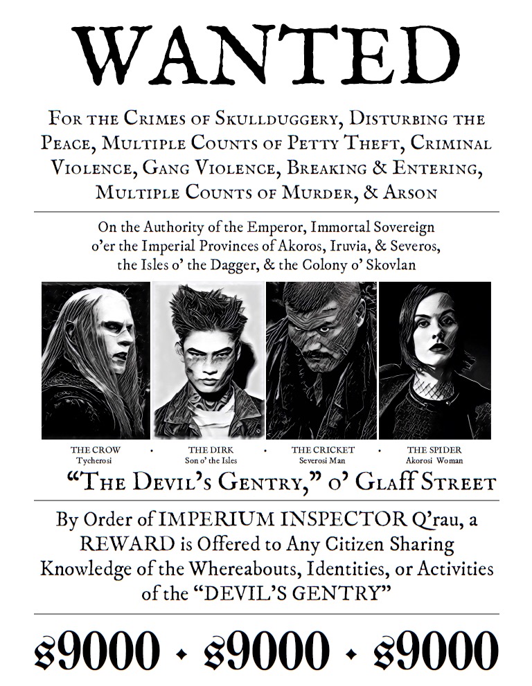
My players finally picked out a name for their crew, so it seemed appropriate to introduce that name in the fiction in a big way… and since they just got an Inspector on their asses last session, what better way than plastering these up all over Doskvol (and my apartment as a surprise when they walked in)?
Watch out for the Devil’s Gentry, y’all. They like to play with fire.

That’s fucking money, my man!
Nice.
So their wanted level is a little high? 😉
This looks awesome. Well done! 🙂
They hit Wanted Level 2 at the end of last session… and because of session we just played yesterday they’re gonna hit Wanted Level 3 unless they can hurry up and frame somebody next game.
So… yes. Their Wanted Level is just a little bit high 😉
I take it they’re all average height and build? 😉
So what did you use to make this awesome wanted poster?
Oh gosh John Williams I wish I could brag and be super impressive right here… I used Google Doc with IM Fell English SC as the font for the WANTED (specifically in a Header), and IM Fell DW Pica most of the body. The reward is written in UnifrakturMaguntia, using an ‘s’ to stand in for a $ sign and mean “silver pieces,” and that’s in its own footer. The photos are simply uploaded into the word doc, set to “in line” and sized until they all fit. I moved the margins down from an inch to a half inch on the left and right side. Most of the hard work was just font sizes, word count, and phrasing.
The pictures were mostly taken from publicity stills and modeling shots taken off the internet, and made black and white in iPhone’s photo editing options (Cricket, I will say, I also uploaded into a Halloween “scarification” photo editing site to add zombie wounds to photos because the player wanted him to have cuts). To give them their particular BitD-esque style in this, I put the B&W photos through this iPhone app called Prisma, and used the “Urban” filter. Then, just emailed myself, slid them into google docs.
Alfred Rudzki Dude, that sounds super impressive to me.