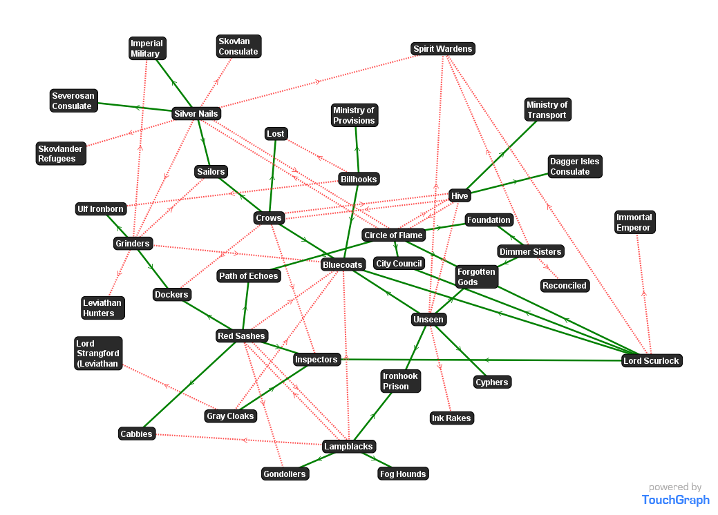
Did a visualization of Allies/Enemies relations, taking the data from v6. Will be updated when new data is available.
It seems they all hate the Spirits Wardens. Must be very lonely to be one 😉
Did a visualization of Allies/Enemies relations, taking the data from v6. Will be updated when new data is available.

Did a visualization of Allies/Enemies relations, taking the data from v6. Will be updated when new data is available.
It seems they all hate the Spirits Wardens. Must be very lonely to be one 😉
Comments are closed.
So awesome. Network Analysis visualizations are the best. Thanks for doing this Stefan Struck.
Do you like TouchGraph? I’ve been making do with dotty and halfviz, but the latter feel very ‘low level’, while the latter is handy but limited.
🙂 You’re welcome. I do stuff like this for a living, so it was great to to it for fun.
Michael Prescott TG is great for dynamic data mining right in front of the screen with changing views. I love to “wiggle” the nodes just to have a bit of fun while thinking about of what I see.
TG is not so great producing static posters like this one with more complex data. I assume that with a full-blown data set displaying allies and enmies at the same time will no longer be possible/useful. Maybe I then have to focus on a selection of factions instead of showing all of them at the same time.
Spirit Wardens seem kind of like the California State Water Quality Board (the single most-often-sued government body in the state, according to a friend who works there). Everybody benefits from what they do, but everybody also has plans that they frustrate just by existing…
So it goes a bit like this (which, IIRC, is from a political cartoon I read in my youth and if I ever find the original I’ll cite it).
“What do you want us to do?”
“Reform the system!”
“Okay, sure. How do you want us to do that?”
“Close the loopholes in the rules.”
“We’ll be glad to! Pesky loopholes are a major problem. Which ones do you want us to close first?”
“All of them except mine.”
…lather, rinse, repeat…
How did we get this far without State Police again?
Very cool! I put together a web app that automates network graphing specifically for gamers. Check out story-chronicles.herokuapp.com/personas
I’d imagine you’d need to prioritise or filter the data you want to show a chart about. You could have multiple visualisations for different aspects. I think I’d also like to have a wants/needs chart at some stage, to work out trickle down effects for supplies being interrupted.